Thursday, March 12, 2009

Metro Shelving

I recently needed shelves for my closet. Never one to buy something that is throw-away, I bought Metro shelving from the Container Store. (Go to "Shop by Category"-"Shelving"-"Metro Convertible"- and from there, I clicked "Design Your Own Metro Commercial Solution").

For one closet I bought enough posts, shelves, and floor protectors for two complete shelves, which I figure I will have for the rest of my life. If I move, maybe they will go in the basement, maybe they will go in another closet- but they will definitely move with me, seeing as I paid 300 bucks for the two of them.

There's a New York Times article on these shelves, which are durable, practical, beautiful, and can be used in many different ways.

And here it is reprinted, just in case:

POSSESSED; Shelves That Bear The Weight of Time

By DAVID COLMAN
Published: Sunday, August 19, 2007

IF you are tired of your morning commute and long for some middle ground between home and office, you are not alone. Look through the pages of Phaidon's mammoth new design survey, ''Contemporary World Interiors,'' where you will find hundreds of jaw-dropping, gravity-defying spaces by today's A-list of design -- Frank Gehry, John Pawson, Marcel Wanders, OMA, Herzog & de Meuron, to name but a few -- and you see that the greatest minds in design share your concerns.

Susan Yelavich, an assistant professor at Parsons the New School of Design, spent years compiling the book, and to her eye what unites the book's many projects is how they manage, even in avant-garde ways, to bring warmth and wit and domesticity to the grandest commercial projects. In other words, how they endow an industrial space with the human element of a home.

Ms. Yelavich has gone through this process herself, in an admittedly haphazard way. In 1977 she moved into a forlorn industrial loft in SoHo, and with her husband, Michael Casey, an artist and general contractor, she proceeded over the years to mold it into a space in which the starkly industrial and the cozily domestic struggle for a yin-yang balance.

''Can-do only takes you so far,'' she said of their amateur approach. ''There are awkwardnesses that I pretend are fine, but other people probably flinch. You know, the washing machine is behind the dining room table because the pipes are there.''

When she was asked to write the Phaidon book some five years ago, she realized that her home office at the center of the loft needed upgrading. She did not plan to acquire what may be the ultimate hybrid of domestic and industrial style; she just needed shelves. So she did what a loft owner does: she went to a Bowery restaurant supply and bought Metro shelving.

Patented by Louis Maslow in 1951 (he founded the Metropolitan Wire Goods Corporation in New York in 1929), the Erecta Shelf system was designed as a modular easy-to-assemble line for the home, available in black paint over steel or brass-plated steel.

But the line did not take off. In 1955 the company retooled to offer chrome-plated shelving designed for food service and medical applications. The result was a hit. Then in the early '70s, design-happy European consumers began using Erecta shelves in their pristine kitchens, a trend that caught on later in the decade in New York, where lofts, and industrial chic, were taking off. By the '80s, the Erecta shelf, known as Metro shelving, was It, the proud mark of the urban frontiersman who was not looking back.

''I realized when I was getting them that this was a memento from the '80s,'' she said. ''There was a sense of picking a cliché.''

But the shelves have stood the test of time. ''What I am interested in is the tension between the ideal and the real,'' Ms. Yelavich said. And the Erecta shelves suggest both the hardheaded pragmatism Ms. Yelavich exhibits for her work -- they are, she said, ''the sturdiest things in the apartment'' -- and the high-flown design idealism she writes about. (Despite the supreme look of utility, the wire shelves are less than practical when it comes to holding books upright and intact, but Ms. Yelavich worked around it, stacking them horizontally).

''They're perfect,'' she said. ''You know, I am a huge reader, and a lot of time is spent in my head, on the couch. So I don't just look at things. I read them. That's the tension with things in my life.''

Happily, her shelves are an open book.


Sunday, January 25, 2009

Thonet's No. 14 Chair


This article, by Alice Rawsthorn, was in Design and Living, Winter 2008, published by the New York Times.

Reproduced below, just in case.

Six Easy Pieces
Thonet's No. 14 chair, still modern after 149 years. By Alice Rawsthorn

It consists of six pieces of wood — two circles, two sticks and a couple of arches — held together by 10 screws and two nuts. Together they make the wooden chair known as Thonet Model No. 14, which, although no one has ever actually done the math, is thought to have seated more people than any other chair in history.
The No. 14 was the result of years of technical experiments by its inventor, the 19th-century German furniture maker Michael Thonet. His ambition was characteristically bold. He wanted to produce the first mass-manufactured chair, which would be sold at an affordable price (three florins, slightly less than a bottle of wine). Many of his rivals had tried to make similar chairs but failed.
Thonet succeeded. When the No. 14 was introduced in 1859, it was the first piece of furniture to be both attractive and inexpensive enough to appeal to everyone from aristocrats to schoolteachers. By 1930, some 50 million No. 14’s had been sold, and millions more have been snapped up since then. Brahms sat on one, as did Lenin, and millions of us have perched comfortably on them in cafes. Another admirer was Le Corbusier. ‘‘Never was a better and more elegant design and a more precisely crafted and practical item created,’’ he said. More recently, the Dutch designer Maarten Baas staged his own homage to Thonet by setting fire to a No. 14-style wooden chair. The charred result was auctioned at Sotheby’s last month.
What makes the No. 14 so special? The answers tell us as much about our attitudes toward design, and how they’ve changed over the last century and a half, as the chair itself.
First and foremost, it fulfills its designated function, as every well-designed object must do. Second, it looks and feels great. ‘‘It’s one of the most beautiful chairs there is,’’ said the German furniture designer Konstantin Grcic. ‘‘And it has exactly the right weight. When you pick it up, it feels perfect.’’ Third, it was startlingly innovative. Thonet perfected a process of bending wood into strong, smooth curves that had eluded his rivals. By making the chair from the fewest parts possible and standardizing their shapes to help unskilled workers assemble them and pack them neatly in shipping crates, he devised a blueprint for efficient mass production.
Fourth, the No. 14 is timeless. It seems to suit every era, which is why Le Corbusier chose it to furnish some of his early-1920s modernist interiors, and it is still the default seating for brasseries. ‘‘It has the freshness of a new product, because it has never been bettered,’’ said the British designer Jasper Morrison. Fifth, it improves with age. ‘‘As the screws and glue loosen, the structure becomes softer,’’ Grcic said. ‘‘Michael Thonet probably didn’t intend that to happen, but it’s a beautiful sensation. I’ve tried to do it with new chairs, but it’s amazingly challenging.’’
Then there’s the history. The No. 14 made industry and modernity seem sexy, rather than associated with belching chimneys and shoddy goods. It also established Thonet’s company, which was run by his five sons after his death, as one of the great industrial dynasties of the late19th century. It employed thousands of workers in enormous factories that were the equivalent of company towns, with schools, libraries, nurseries and shops where goods were sold in its private currency.
The No. 14 can even claim to have been a pioneer of sustainability. The early models were made in a factory in the village of Koritschan, in what is now the Czech Republic, from beechwood grown in nearby forests. Even when extra supplies of wood had to be shipped in from farther afield, Thonet limited its carbon footprint by making its own tools and machinery.
Baas’s charred homage to the No. 14 isn’t the only recent tribute; Sanaa, the Japanese architecture firm behind the New Museum, has created a metal chair in a similar shape. Ikea developed a supercheap hollow composite version called the Ogla, which has been one of its best sellers since 1961.
While Thonet itself fragmented years ago — there are now three Thonets, each making slightly different versions of the original designs, in Germany, Austria and the United States — the No. 14 may have lost some of its populist sheen. The model sold at Moss (made by Gebrüder Thonet Vienna, which is owned by the Italian company Poltrona Frau) costs $625. This may be rectified by the German Thonet, which is collaborating with the Japanese retailer Muji and designers like Grcic and Morrison on a new collection of affordable chairs inspired by its vintage models. The results, which were unveiled in Tokyo last month, included a new take on the No. 14 developed by the British designer James Irvine, just in time for the chair’s 150th-birthday celebration next year.

Friday, January 9, 2009

Must-Haves for the Kitchen per the NYTimes

Love this article. Olive oil in a hand-pumped sprayer instead of mystery oil in an aerosol can. Simple concoctions instead of bottled salad dressing. Lemons. Dried beans. Frozen vegetables. A variety of different grains. Maple syrup. It's the kind of stuff people would be buying anyway if advertising didn't exist. Simple, inexpensive.

Monday, January 5, 2009

Watches

Here is the watch I wanted:The Cartier Tank Francaise watch. (I have great taste.)

Here is the watch I got:

The Victorinox Alliance. This was significantly less than the Cartier version, and the lady at Nordstrom said the face wouldn't scratch, which is what I was aiming for- something that would last.

Saturday, January 3, 2009

About Grout

Added to my short list of most-excellent home-repair people: About Grout. They re-grouted and re-caulked my shower to a lovely, gleaming, uniform whiteness. Perfect lines abound. Cute to boot.

Sunday, November 30, 2008

Euro Street Style

From Lucky Magazine: Parisian street style.

Update: The New York Times Magazine this week has an article on "street-style photoblogs", and from the sound of it, they like Garance Dore as much as I do (which is to say, a lot).

Besides Garance Dore, they also list many other street style blogs they like.

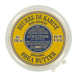
Shea Butter

100% pure Shea Butter. There is no better moisturizer, this from someone with very dry, sensitive skin. All natural, so it doesn't irritate. Great for lips, too, and as a hair gel.